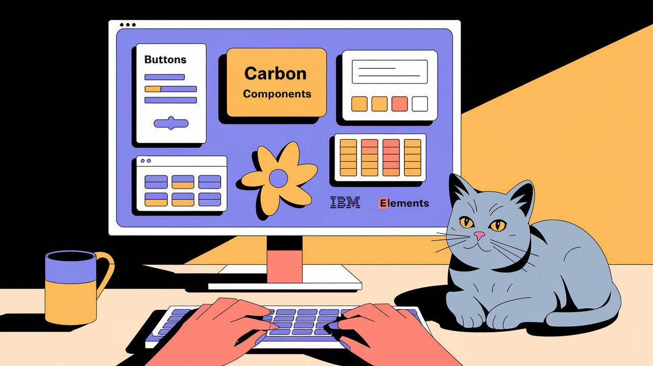
Orchestrating UI Harmony with Carbon Components React
Carbon Components React, part of the Carbon Design System, is a powerful library that brings IBM’s design language to life in React applications. This comprehensive toolkit offers a wide array of customizable, accessible components that enable developers to create consistent and visually appealing user interfaces with ease.
Harmonizing Design and Functionality
Carbon Components React stands out as a symphony of design and functionality, offering developers a rich set of tools to create harmonious user interfaces. The library boasts several key features that make it a top choice for React developers:
-
Accessibility-First Approach: Every component is designed with accessibility in mind, ensuring that your applications are usable by everyone, regardless of their abilities.
-
Customizable Theming: Easily adapt the components to match your brand’s visual identity with the flexible theming system.
-
Responsive Design: Components are built to work seamlessly across various screen sizes and devices.
-
Performance Optimized: The library is engineered for optimal performance, ensuring smooth user experiences even in complex applications.
-
Extensive Documentation: Comprehensive guides and API references make it easy to get started and master the library.
Setting the Stage: Installation
To begin your journey with Carbon Components React, you’ll need to set up your development environment. Here’s how to get started:
Using npm:
npm install @carbon/react
Or if you prefer yarn:
yarn add @carbon/react
Once installed, you can import the necessary CSS styles in your main application file:
import '@carbon/react/scss/styles.scss';
Composing Your UI: Basic Usage
Let’s explore how to use some of the fundamental components provided by Carbon Components React. We’ll start with a simple example that showcases a button and a text input.
import React from 'react';
import { Button, TextInput } from '@carbon/react';

const MyComponent = () => {
  return (
    <div>
      <TextInput
        id="my-text-input"
        labelText="Enter your name"
        placeholder="John Doe"
      />
      <Button>Submit</Button>
    </div>
  );
};

export default MyComponent;
In this example, we’ve imported the Button and TextInput components from @carbon/react. The TextInput component includes a label and placeholder, while the Button component is used to create a submit button.
Advanced Compositions: Creating Complex UIs
Carbon Components React shines when creating more complex user interfaces. Let’s explore an advanced example that incorporates a data table with pagination and a modal dialog.
import React, { useState } from 'react';
import {
  DataTable,
  Table,
  TableHead,
  TableRow,
  TableHeader,
  TableBody,
  TableCell,
  Pagination,
  Modal,
  Button
} from '@carbon/react';

const AdvancedComponent = () => {
  const [isModalOpen, setIsModalOpen] = useState(false);

  const headers = [
    { key: 'name', header: 'Name' },
    { key: 'protocol', header: 'Protocol' },
    { key: 'port', header: 'Port' },
    { key: 'rule', header: 'Rule' },
  ];

  const rows = [
    {
      id: '1',
      name: 'Load Balancer 1',
      protocol: 'HTTP',
      port: 80,
      rule: 'Round robin',
    },
    {
      id: '2',
      name: 'Load Balancer 2',
      protocol: 'HTTPS',
      port: 443,
      rule: 'Least connections',
    },
  ];

  return (
    <div>
      <DataTable rows={rows} headers={headers}>
        {({ rows, headers, getTableProps, getHeaderProps, getRowProps }) => (
          <Table {...getTableProps()}>
            <TableHead>
              <TableRow>
                {headers.map((header) => (
                  <TableHeader {...getHeaderProps({ header })}>
                    {header.header}
                  </TableHeader>
                ))}
              </TableRow>
            </TableHead>
            <TableBody>
              {rows.map((row) => (
                <TableRow {...getRowProps({ row })}>
                  {row.cells.map((cell) => (
                    <TableCell key={cell.id}>{cell.value}</TableCell>
                  ))}
                </TableRow>
              ))}
            </TableBody>
          </Table>
        )}
      </DataTable>
      <Pagination
        backwardText="Previous page"
        forwardText="Next page"
        itemsPerPageText="Items per page:"
        page={1}
        pageSize={10}
        pageSizes={[10, 20, 30, 40, 50]}
        totalItems={100}
      />
      <Button onClick={() => setIsModalOpen(true)}>Open Modal</Button>
      <Modal
        open={isModalOpen}
        modalHeading="Modal heading"
        primaryButtonText="Primary Button"
        secondaryButtonText="Secondary Button"
        onRequestClose={() => setIsModalOpen(false)}
      >
        <p>Modal content goes here</p>
      </Modal>
    </div>
  );
};

export default AdvancedComponent;
This advanced example demonstrates the power and flexibility of Carbon Components React. We’ve created a data table with custom headers and rows, added pagination for better data management, and included a modal dialog that can be triggered by a button click.
Conclusion: A Symphony of Design and Functionality
Carbon Components React offers a comprehensive suite of tools for creating beautiful, accessible, and consistent user interfaces. By leveraging this powerful library, developers can focus on crafting exceptional user experiences while adhering to IBM’s design principles.
As you continue to explore Carbon Components React, you’ll discover even more advanced features and components that can elevate your React applications. Whether you’re building enterprise-level software or consumer-facing websites, this library provides the building blocks for creating harmonious and user-friendly interfaces.
For more insights into React libraries and components, check out our articles on React Beautiful DnD Exploration for drag-and-drop functionality, and React Big Calendar Guide for implementing calendar features in your applications.
