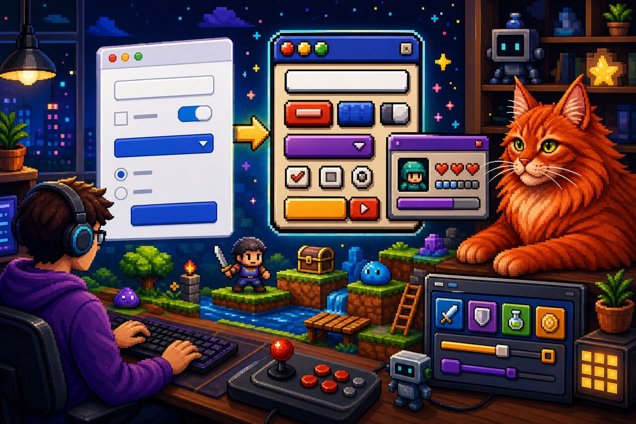

Most CSS frameworks are about making serious things look serious: clean grids, accessible defaults, restrained palettes that survive code review. NES.css is the gleeful opposite. It is a styling-only framework that makes plain old HTML look like the on-screen UI of an 8-bit Nintendo game, complete with chunky pixel-art borders, blocky buttons, speech balloons, and actual pure-CSS sprites of Mario, Kirby, and the GitHub Octocat.
What makes it genuinely useful is that it solves an aesthetic problem that is surprisingly tedious to solve by hand. Pixel-perfect borders made from box-shadow stacks and the flat retro NES palette are fiddly to author yourself. NES.css packages all of that into a single stylesheet with zero runtime dependencies, so it drops into React, Vue, Svelte, or a bare HTML file identically. It is the perfect choice for game-jam sites, retro portfolios, 404 pages, hackathon demos, and devtool easter eggs — anywhere you want an instant hit of nostalgia.
One thing to set expectations on up front: NES.css is components-only. As the docs put it, "NES.css only provides components. You will need to define your own layout." There is no grid system and no utility-layout engine. You bring your own flexbox or grid and sprinkle NES.css classes onto individual elements.
What's in the Cartridge
NES.css ships a remarkably complete catalog of styled native elements, all driven by simple class names:
- Buttons with semantic variants (
is-primary,is-success,is-warning,is-error). - Containers that can carry a title, be centered, rounded, or dark.
- Form controls — inputs, textareas, selects, checkboxes, and radios — styled to match.
- Dialogs built on the native
<dialog>element, plus progress bars on native<progress>. - Badges, speech balloons, lists, and tables for content.
- Pixel-art icons including hearts, stars, coins, trophies, and brand logos (GitHub, Twitter, YouTube, Twitch, and more).
- Pixel-art characters —
.nes-mario,.nes-kirby,.nes-bulbasaur,.nes-octocat, and friends — rendered entirely in CSS, no image files involved.
It is also tiny in spirit: pure CSS, MIT licensed, and stable. The last feature release was December 2019, which is worth reading as "feature-complete and mature" rather than abandoned. For the playful use cases it targets, that stability is a feature.
Loading the Game
Install it from npm or Yarn:
npm install nes.css
# or
yarn add nes.css
If you just want to experiment, a CDN link is the fastest path:
<link href="https://unpkg.com/nes.css@latest/css/nes.min.css" rel="stylesheet" />
NES.css ships two builds, and the difference matters:
css/nes.min.css— the full framework, which includes a global CSS reset.css/nes-core.min.css— core only, without the reset. Reach for this when dropping NES.css into an existing app where you don't want it restyling your base elements.
The Font Is Not Optional
Here is the single most common gotcha: NES.css does not bundle a font, and the entire 8-bit look depends on a pixel font. The project recommends Press Start 2P from Google Fonts. You have to load it and apply it yourself:
<link href="https://fonts.googleapis.com/css?family=Press+Start+2P" rel="stylesheet" />
<link href="https://unpkg.com/nes.css@latest/css/nes.min.css" rel="stylesheet" />
<style>
  html, body, pre, code, kbd, samp {
    font-family: "Press Start 2P", cursive;
  }
</style>
Forget the font and your components still render — they just lose most of their retro soul. Press Start 2P only covers Latin characters, so for non-Latin scripts the docs point to alternative pixel fonts like 美咲フォント (Japanese), 둥근모꼴 (Korean), or Zpix (Chinese).
Dropping It Into React
Because NES.css is framework-agnostic CSS, React usage is delightfully boring: import the stylesheet once, then apply classNames. There is no provider, no hook, no config object.
import "nes.css/css/nes.min.css";
// Load Press Start 2P via a <link> in index.html or a font package.

function RetroCard() {
  return (
    <div className="nes-container with-title is-rounded">
      <p className="title">Player 1</p>
      <p className="nes-text is-primary">Press start to begin.</p>
      <button type="button" className="nes-btn is-primary">
        Start
      </button>
      <i className="nes-mario" />
    </div>
  );
}
That single component already gives you a titled, rounded panel, colored retro text, a primary action button, and a tiny pixel Mario — all from class names on native elements.
A couple of notes for React users worth internalizing early. There is no official React component wrapper; you use raw classes, and that is genuinely the recommended approach. Community wrappers exist but are unofficial and unmaintained, so you are better off staying on the CSS directly. And because the full build ships a reset, importing nes.css globally into an established app can clobber your base styles — prefer nes.css/css/nes-core.min.css if you only want the component styling. The classes are all namespaced with nes-, so they coexist happily with Tailwind or CSS Modules.
Building a Form That Looks Like a Save Screen
Forms are where NES.css shines for actual interactive UI. Each control has a styled class, and inputs are typically wrapped in a .nes-field alongside a <label>. Validation states map to the same is-success / is-warning / is-error modifiers you have already seen.
function CharacterForm() {
  return (
    <form>
      <div className="nes-field">
        <label htmlFor="name_field">Your name</label>
        <input
          type="text"
          id="name_field"
          className="nes-input"
          placeholder="Mario"
        />
      </div>

      <label>
        <input type="checkbox" className="nes-checkbox" defaultChecked />
        <span>Enable sound</span>
      </label>

      <label>
        <input type="radio" className="nes-radio" name="difficulty" />
        <span>Normal</span>
      </label>

      <div className="nes-select">
        <select required defaultValue="">
          <option value="" disabled hidden>
            Select a class...
          </option>
          <option>Warrior</option>
          <option>Mage</option>
        </select>
      </div>
    </form>
  );
}
The select pattern is a small but important detail: you wrap the native <select> in a .nes-select div rather than styling the element directly, which lets NES.css draw its pixel-art dropdown chrome around it.
Wiring Up a Native Dialog
NES.css styles the native <dialog> element but ships zero JavaScript, which means opening and closing dialogs is your job. In React this is clean — grab the element with a ref and call the browser's own showModal():
import { useRef } from "react";

function ConfirmDialog() {
  const ref = useRef<HTMLDialogElement>(null);

  return (
    <>
      <button className="nes-btn" onClick={() => ref.current?.showModal()}>
        Open
      </button>
      <dialog className="nes-dialog is-rounded" ref={ref}>
        <form method="dialog">
          <p className="title">Confirm</p>
          <p>Save your game?</p>
          <menu className="dialog-menu">
            <button className="nes-btn">No</button>
            <button className="nes-btn is-primary">Yes</button>
          </menu>
        </form>
      </dialog>
    </>
  );
}
The <form method="dialog"> is the magic that makes the buttons close the dialog without any extra handlers — that is native browser behavior, and NES.css simply dresses it up. The same "style native elements, you handle interactivity" philosophy applies to <progress> bars too:
<progress className="nes-progress is-success" value={75} max={100} />
Sprites, Icons, and Other Showmanship
The pixel-art characters and icons are NES.css's signature party trick, and no mainstream CSS framework offers anything like them. They are rendered entirely with CSS — gradients and stacked box-shadows — so there are no image requests.
function Showcase() {
  return (
    <section>
      <i className="nes-mario" />
      <i className="nes-kirby" />
      <i className="nes-pokeball" />
      <i className="nes-octocat animate" />

      <i className="nes-icon heart" />
      <i className="nes-icon heart is-half" />
      <i className="nes-icon star is-empty" />
      <i className="nes-icon github is-large" />
    </section>
  );
}
Hearts and stars support is-empty and is-half states, which makes them perfect for rating widgets or health bars. The brand icons cover most of the social platforms you'd want to link to. One performance note worth keeping in mind: because the sprites lean on lots of box-shadow and gradient tricks, scattering dozens of pixel-art characters across a single page can get CSS-heavy. A few accents look fantastic; a hundred animated Octocats might make your fan spin up.
Retheming the Palette
Since the SCSS source ships inside the package, you are not locked into the default NES palette. The package exposes a sass field so bundlers and Sass toolchains can import the partials directly, and you can override the Sass variables in scss/base/variables.scss and color-palette.scss before compiling.
If you don't want to touch the build pipeline, the simplest customization is plain CSS overrides after importing the framework — adjust colors and swap the font in your own stylesheet. Because everything is just global classes, you can also cherry-pick: import nes-core and pull in only the component partials you actually use.
Choosing Your Era
NES.css lives in a small, charming niche of retro CSS frameworks, and which one you pick is mostly a question of vibe. If you want an operating system desktop look — windows, tabs, sliders, tree views — reach for 98.css, XP.css, or 7.css instead; those emulate old Windows chrome rather than a game console. PSone.css is the same idea as NES.css but for the PlayStation 1 era, while system.css channels the classic monochrome Mac. And if you specifically need interactive React components with props and ongoing maintenance, RetroUI is a real Tailwind-based component library rather than a CSS skin.
Pick NES.css when you want the iconic 8-bit Nintendo aesthetic, the playful pixel-art characters, a tiny mental model, and zero dependencies. It is the most popular framework in this space by a wide margin, and the pixel sprites are a genuine unique selling point.
Game Over, or New Game?
NES.css is one of those libraries that is a pure pleasure precisely because it does one small thing and does it with charm. There is almost nothing to learn — it's classes on native elements — and yet the payoff is immediate and delightful. For a portfolio site, a game jam, an error page, or any place that could use a wink of nostalgia, it turns a flat page into an 8-bit world with a single import.
Just remember its boundaries: it styles, it does not script; it needs a pixel font you load yourself; it offers components, not layout; and the pixel font's legibility cost means it is the wrong tool for dense, accessibility-critical, content-heavy production apps. Use it where joy matters more than density, and NES.css will make your project feel like it shipped on a cartridge. Press start.