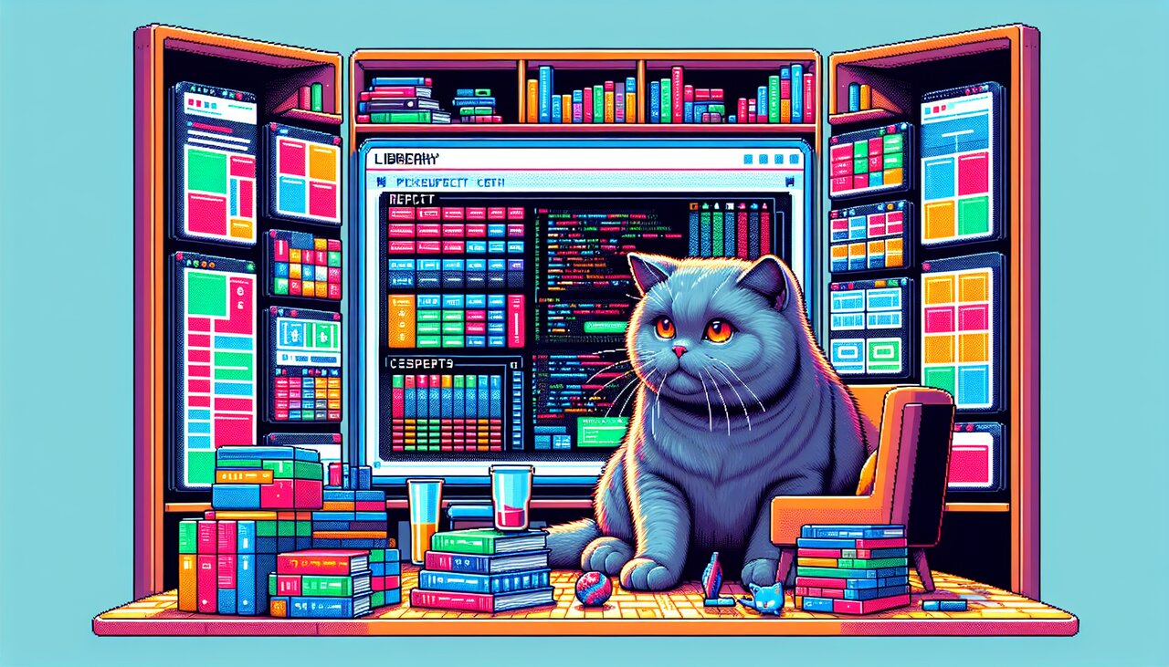
8bitcn/ui: Press Start on Pixel-Perfect React Components

Remember when interfaces had charm? When every button had a pixelated border and every progress bar looked like it belonged in a dungeon crawler? 8bitcn/ui brings that energy back to modern React development, wrapping 56+ fully accessible components in glorious 8-bit aesthetics. Built on top of shadcn/ui and Radix UI primitives, it gives you the nostalgia of the NES era with the developer experience of 2026.
Whether you are building a retro-themed portfolio, a browser game UI, or just want your SaaS dashboard to look like it runs on a cartridge, 8bitcn/ui delivers pixel-perfect components through the same shadcn CLI you already know.
What Is in the Box
8bitcn/ui is not a typical npm package. It uses the shadcn registry model, meaning components are copied directly into your project rather than imported from node_modules. You own the code. You can customize every pixel.
The library includes:
- 56+ standard UI components covering everything from accordions and buttons to date pickers and toast notifications
- Gaming-specific components like health bars, mana bars, XP bars, and inventory items
- 20+ pre-built block templates for game menus, auth flows, dashboards, and leaderboards
- Multiple retro themes with a built-in Theme Selector and Retro Mode Switcher
- Full keyboard navigation and ARIA support inherited from Radix UI
Getting the Cartridge Loaded
Since 8bitcn/ui uses the shadcn registry system, you need a project with shadcn/ui already configured. Then install individual components via the CLI:
pnpm dlx shadcn@latest add @8bitcn/button
The first time you run this, it registers the 8bitcn source in your components.json:
{
  "@8bitcn": "https://8bitcn.com/r/{name}.json"
}
From there, every component lands in components/ui/8bit/ inside your project. You can also use npx or yarn dlx if that is your preference:
npx shadcn@latest add @8bitcn/card
yarn dlx shadcn@latest add @8bitcn/dialog
Your First Pixel Button
Once installed, importing and using components feels just like shadcn/ui:
import { Button } from "@/components/ui/8bit";

export function HeroSection() {
  return (
    <div className="flex flex-col items-center gap-4 p-8">
      <h1 className="text-4xl font-bold">Welcome, Adventurer</h1>
      <Button onClick={() => console.log("Quest accepted!")}>
        Start Quest
      </Button>
      <Button variant="outline">View Inventory</Button>
    </div>
  );
}
The button renders with pixelated borders, retro font treatment, and that unmistakable NES-era vibe -- all while being fully accessible and keyboard-navigable.
Building a Player HUD
Where 8bitcn/ui really shines is its gaming-specific components. Here is a heads-up display that would feel right at home in any RPG:
import {
  HealthBar,
  ManaBar,
  XPBar,
  Badge,
  Card,
} from "@/components/ui/8bit";

interface PlayerStats {
  name: string;
  level: number;
  health: number;
  maxHealth: number;
  mana: number;
  maxMana: number;
  xp: number;
  xpToNext: number;
}

export function PlayerHUD({ stats }: { stats: PlayerStats }) {
  return (
    <Card className="p-4 w-80">
      <div className="flex items-center justify-between mb-4">
        <span className="text-lg font-bold">{stats.name}</span>
        <Badge>Lv. {stats.level}</Badge>
      </div>
      <div className="flex flex-col gap-3">
        <HealthBar value={stats.health} max={stats.maxHealth} />
        <ManaBar value={stats.mana} max={stats.maxMana} />
        <XPBar value={stats.xp} max={stats.xpToNext} />
      </div>
    </Card>
  );
}
Health bars drain in satisfying pixel chunks. Mana glows blue. XP creeps forward toward the next level. It is the small details that make the aesthetic work.
Level Up: Advanced Patterns
Composing Game Menus with Blocks
8bitcn/ui ships with pre-built block templates for common gaming interfaces. You can install entire blocks the same way you install components:
pnpm dlx shadcn@latest add @8bitcn/main-menu
pnpm dlx shadcn@latest add @8bitcn/pause-menu
Then compose them into a full game shell:
import { MainMenu } from "@/components/ui/8bit/blocks/main-menu";
import { PauseMenu } from "@/components/ui/8bit/blocks/pause-menu";
import { GameOver } from "@/components/ui/8bit/blocks/game-over";
import { useState } from "react";

type GameState = "menu" | "playing" | "paused" | "gameover";

export function GameShell() {
  const [state, setState] = useState<GameState>("menu");

  if (state === "menu") {
    return (
      <MainMenu
        onNewGame={() => setState("playing")}
        onContinue={() => setState("playing")}
      />
    );
  }

  if (state === "paused") {
    return (
      <PauseMenu
        onResume={() => setState("playing")}
        onQuit={() => setState("menu")}
      />
    );
  }

  if (state === "gameover") {
    return (
      <GameOver
        score={9001}
        onRetry={() => setState("playing")}
        onMainMenu={() => setState("menu")}
      />
    );
  }

  return <div>Your game renders here</div>;
}
Each block is a self-contained template you can tear apart and reassemble. Since the code lives in your project, there is nothing stopping you from reskinning a pause menu into a settings panel.
Theme Switching and Retro Modes
The library includes multiple built-in color themes inspired by classic consoles. You can let users switch between them at runtime:
import { ThemeSelector, RetroModeSwitcher } from "@/components/ui/8bit";

export function SettingsPanel() {
  return (
    <div className="flex flex-col gap-6 p-6">
      <h2 className="text-xl font-bold">Display Settings</h2>
      <div className="flex flex-col gap-4">
        <label className="text-sm">Color Theme</label>
        <ThemeSelector />
      </div>
      <div className="flex flex-col gap-4">
        <label className="text-sm">Retro Mode</label>
        <RetroModeSwitcher />
      </div>
    </div>
  );
}
The Retro Mode Switcher toggles between the pixel-art styling and the standard shadcn/ui look, which is great for apps that want to offer both aesthetics.
Mixing 8-bit and Standard Components
Because 8bitcn/ui wraps shadcn/ui primitives, you can freely mix retro and modern components in the same project. Use the 8-bit versions for your game-facing interfaces and standard shadcn components for your admin panels:
import { Button as PixelButton } from "@/components/ui/8bit";
import { Button } from "@/components/ui/button";
import { Dialog, DialogContent, DialogTrigger } from "@/components/ui/8bit";

export function HybridUI() {
  return (
    <div className="flex gap-4">
      <PixelButton>Enter Dungeon</PixelButton>
      <Dialog>
        <DialogTrigger asChild>
          <Button variant="outline">Admin Settings</Button>
        </DialogTrigger>
        <DialogContent>
          <p>This dialog has pixel borders but clean content.</p>
        </DialogContent>
      </Dialog>
    </div>
  );
}
Insert Coin to Continue
8bitcn/ui occupies a unique niche. Other retro CSS frameworks like NES.css exist, but none offer the same depth of React component logic, accessibility, and developer ergonomics. The shadcn registry model means no version conflicts, no bundle bloat, and full ownership of every line of code.
With 56+ components, gaming-specific widgets, pre-built block templates, and an active community of contributors, it is the fastest way to give your React project that retro arcade glow. Whether you are building a game jam project, a nostalgic portfolio, or just want your buttons to look like they came from 1986, 8bitcn/ui has your pixels covered.