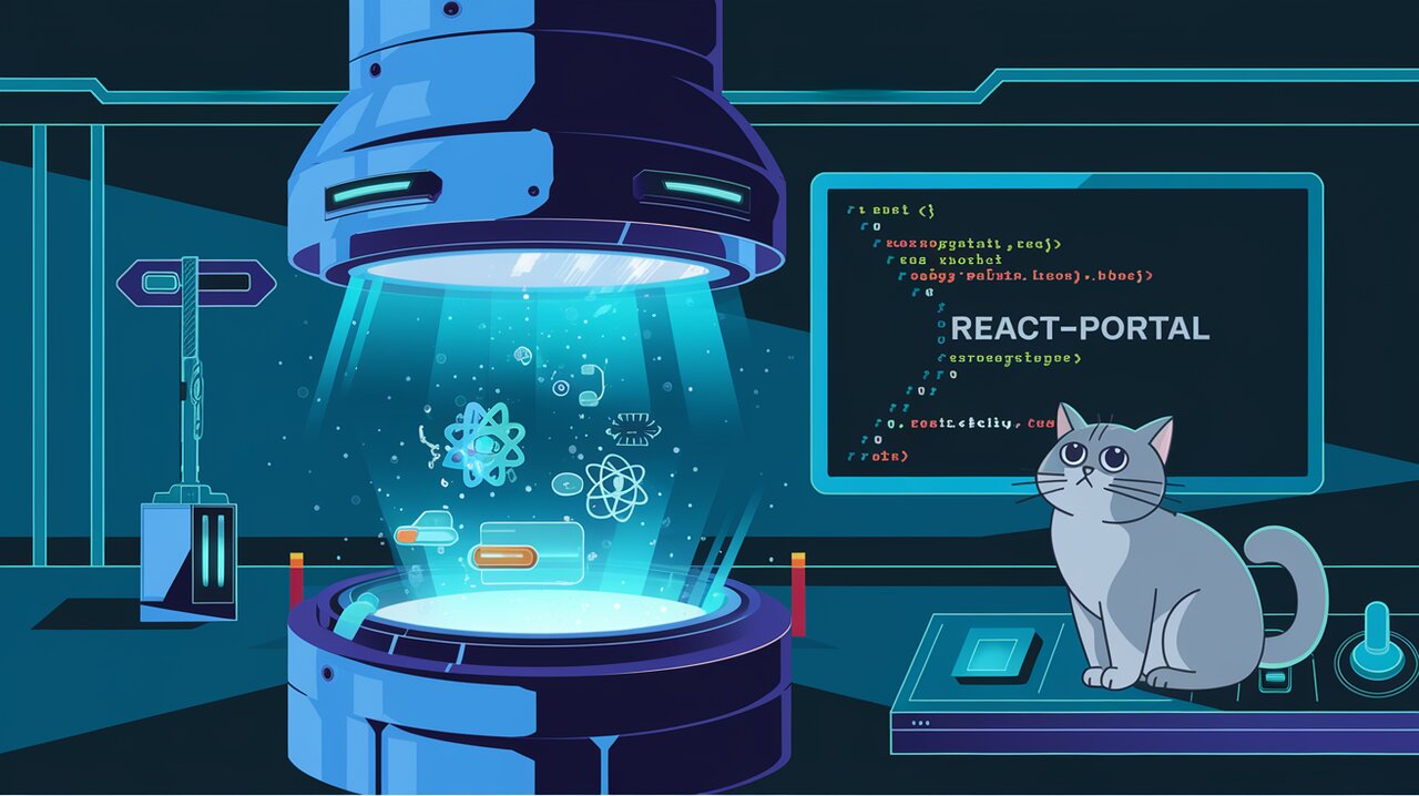
Teleport Your React Components: Mastering react-portal
React Portal is a powerful library that enables developers to render React components at any DOM node, regardless of their position in the component tree. This functionality is particularly useful for creating modals, lightboxes, tooltips, and other UI elements that need to break out of their parent container’s layout constraints.
Features
React Portal offers several key features that make it an essential tool for React developers:
- Utilizes React v16’s official API for creating portals
- Provides a fallback for React v15
- Supports server-side rendering
- Allows targeting of user-specified DOM elements
- Supports returning arrays (no wrapper divs needed)
- Offers both
PortalandPortalWithStatecomponents for flexibility and convenience - Provides built-in support for closing on ESC key press and outside mouse clicks
- Lightweight with no dependencies
Installation
To get started with react-portal, you can install it using npm or yarn:
npm install react react-dom react-portal
or
yarn add react react-dom react-portal
Basic Usage
Using the Portal Component
The Portal component is the core building block of react-portal. It allows you to render its children into a new React tree appended to a specified DOM element (defaulting to document.body).
import React from 'react';
import { Portal } from 'react-portal';

const BasicPortalExample: React.FC = () => {
  return (
    <div>
      <h3>Basic Portal Example</h3>
      <Portal>
        <p>This content is rendered at the end of document.body!</p>
      </Portal>
    </div>
  );
};
In this example, the paragraph inside the Portal component will be rendered at the end of the document.body, regardless of where the BasicPortalExample component is placed in the React tree.
Targeting a Specific DOM Element
You can also specify a target DOM element for the portal:
import React from 'react';
import { Portal } from 'react-portal';

const TargetedPortalExample: React.FC = () => {
  return (
    <div>
      <h3>Targeted Portal Example</h3>
      <div id="portal-target"></div>
      <Portal node={document.getElementById('portal-target')}>
        <p>This content is rendered inside the #portal-target element!</p>
      </Portal>
    </div>
  );
};
In this case, the portal content will be rendered inside the element with the ID “portal-target”.
Advanced Usage
Using PortalWithState
The PortalWithState component provides a more convenient way to handle portal state, including open/close functionality and event handling.
import React from 'react';
import { PortalWithState } from 'react-portal';

const PortalWithStateExample: React.FC = () => {
  return (
    <PortalWithState closeOnOutsideClick closeOnEsc>
      {({ openPortal, closePortal, isOpen, portal }) => (
        <React.Fragment>
          <button onClick={openPortal}>Open Portal</button>
          {portal(
            <div>
              <h3>Portal Content</h3>
              <p>This is an advanced portal with built-in state management.</p>
              <button onClick={closePortal}>Close Portal</button>
            </div>
          )}
        </React.Fragment>
      )}
    </PortalWithState>
  );
};
This example demonstrates how to use PortalWithState to create a portal that can be opened and closed, with built-in support for closing on outside clicks and ESC key press.
Custom Portal Behavior
You can customize the behavior of PortalWithState by passing props:
import React from 'react';
import { PortalWithState } from 'react-portal';

const CustomPortalExample: React.FC = () => {
  return (
    <PortalWithState
      closeOnOutsideClick={false}
      closeOnEsc={false}
      defaultOpen={true}
      onOpen={() => console.log('Portal opened')}
      onClose={() => console.log('Portal closed')}
    >
      {({ closePortal, portal }) => (
        portal(
          <div>
            <h3>Custom Portal</h3>
            <p>This portal starts open and can only be closed by the button.</p>
            <button onClick={closePortal}>Close Portal</button>
          </div>
        )
      )}
    </PortalWithState>
  );
};
This example shows how to create a portal that starts open, doesn’t close on outside clicks or ESC key press, and logs messages when opened or closed.
Server-Side Rendering
React Portal supports server-side rendering out of the box. When rendering on the server, the portal content will be rendered in place, and once the client-side JavaScript takes over, it will be moved to the correct DOM location.
import React from 'react';
import { Portal } from 'react-portal';

const SSRPortalExample: React.FC = () => {
  return (
    <div>
      <h3>Server-Side Rendering Example</h3>
      <Portal>
        <p>This content will be rendered in place on the server, then moved to document.body on the client.</p>
      </Portal>
    </div>
  );
};
This example will work correctly in both server-side and client-side environments.
Conclusion
React Portal provides a powerful and flexible way to render React components outside of their normal DOM hierarchy. Whether you’re building modals, tooltips, or any other UI element that needs to break out of its container, react-portal offers an elegant solution. Its support for both basic and advanced use cases, along with server-side rendering compatibility, makes it a valuable tool in any React developer’s toolkit.
By mastering react-portal, you can create more dynamic and interactive user interfaces, improving the overall user experience of your React applications. As you continue to explore its capabilities, you’ll find that react-portal opens up new possibilities for component composition and layout management in your projects.
