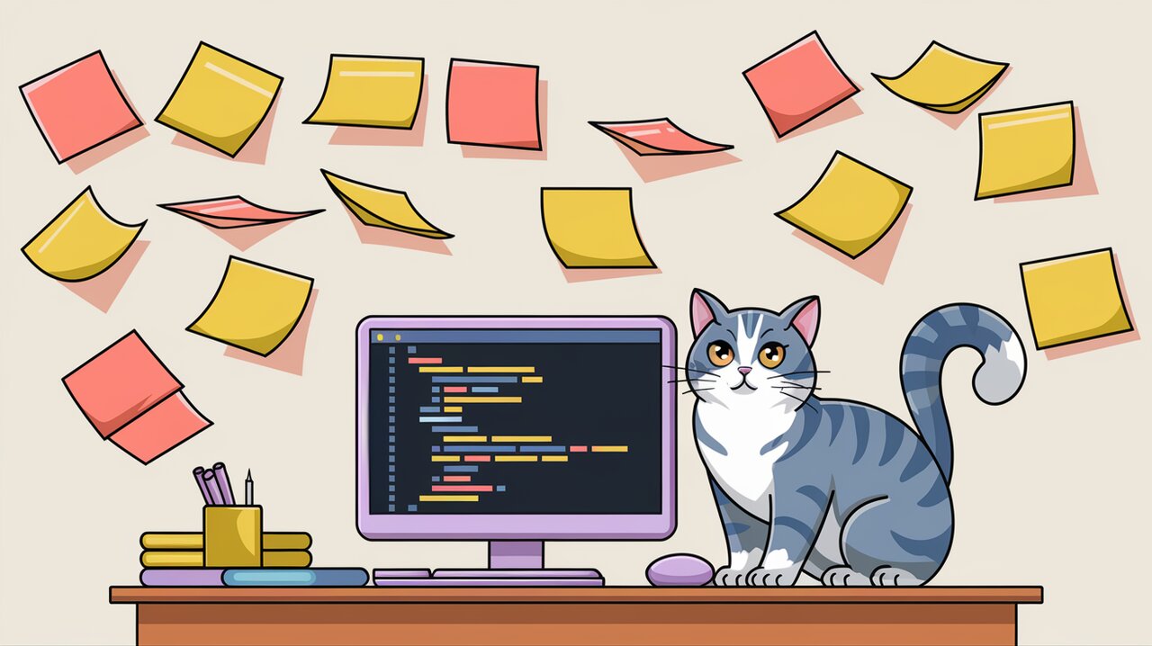
Stick It to the Viewport: Mastering React-StickyNode
React-stickynode is a comprehensive and high-performance sticky component for React applications. It’s designed to keep a target element in view as users scroll through a page, handling various scenarios that many other sticky components struggle with. Let’s dive into the features and usage of this powerful library.
Features
React-stickynode stands out from other sticky components due to its advanced capabilities:
- Efficient scrolling: It retrieves
scrollToponly once for all sticky components and listens to throttled scrolling events for better performance. - Smooth updates: Uses requestAnimationFrame (rAF) to update sticky status, ensuring smooth visual transitions.
- Flexible positioning: Supports top offset from the screen and bottom boundary to control sticky behavior.
- Responsive design support: Handles sticky targets with various width units, including percentages.
- Tall target handling: Uniquely manages cases where the sticky target is taller than the viewport.
Installation
To start using react-stickynode in your project, you can install it via npm or yarn:
npm install react-stickynode
or
yarn add react-stickynode
Basic Usage
Simple Sticky Component
Let’s start with a basic example of how to use react-stickynode:
import React from 'react';
import Sticky from 'react-stickynode';

const SimpleSticky: React.FC = () => {
  return (
    <Sticky>
      <h2>This content will stick to the viewport</h2>
    </Sticky>
  );
};

export default SimpleSticky;
In this example, the <h2> element will stick to the top of the viewport when the user scrolls past it. By default, it will stick to the very top (0px offset).
Sticky with Offset
You can specify an offset from the top of the viewport:
import React from 'react';
import Sticky from 'react-stickynode';

const StickyWithOffset: React.FC = () => {
  return (
    <Sticky top={50}>
      <nav>
        <ul>
          <li>Home</li>
          <li>About</li>
          <li>Contact</li>
        </ul>
      </nav>
    </Sticky>
  );
};

export default StickyWithOffset;
This navigation menu will stick 50 pixels from the top of the viewport when scrolling.
Advanced Usage
Handling State Changes
React-stickynode allows you to react to changes in the sticky state:
import React from 'react';
import Sticky from 'react-stickynode';

const StickyWithStateChange: React.FC = () => {
  const handleStateChange = (status: { status: number }) => {
    switch (status.status) {
      case Sticky.STATUS_ORIGINAL:
        console.log('Component is in its original position');
        break;
      case Sticky.STATUS_RELEASED:
        console.log('Component is released');
        break;
      case Sticky.STATUS_FIXED:
        console.log('Component is fixed/sticky');
        break;
    }
  };

  return (
    <Sticky onStateChange={handleStateChange}>
      <div>Content that sticks and reports its state</div>
    </Sticky>
  );
};

export default StickyWithStateChange;
This example demonstrates how to use the onStateChange prop to perform actions based on the current sticky state.
Using Bottom Boundary
You can set a bottom boundary to determine when the sticky element should stop being sticky:
import React from 'react';
import Sticky from 'react-stickynode';

const StickyWithBoundary: React.FC = () => {
  return (
    <div>
      <Sticky bottomBoundary="#content-end">
        <aside>Sidebar content</aside>
      </Sticky>
      <main>
        {/* Main content */}
      </main>
      <div id="content-end"></div>
    </div>
  );
};

export default StickyWithBoundary;
In this example, the sidebar will stop being sticky when it reaches the element with the ID “content-end”.
Freezing Sticky Behavior
For cases where you need to temporarily disable the sticky behavior, you can use the shouldFreeze prop:
import React, { useState } from 'react';
import Sticky from 'react-stickynode';

const FreezableSticky: React.FC = () => {
  const [isEditing, setIsEditing] = useState(false);

  const shouldFreeze = () => isEditing;

  return (
    <Sticky shouldFreeze={shouldFreeze}>
      <div>
        <h3>Editable Content</h3>
        <button onClick={() => setIsEditing(!isEditing)}>
          {isEditing ? 'Save' : 'Edit'}
        </button>
        {isEditing ? (
          <textarea defaultValue="Edit this content" />
        ) : (
          <p>This content can be edited</p>
        )}
      </div>
    </Sticky>
  );
};

export default FreezableSticky;
This component will stop updating its sticky behavior when in editing mode, preventing potential jumps or visual glitches during user input.
Conclusion
React Stickynode is a powerful and flexible library for creating sticky components in React applications. Its ability to handle complex scenarios, such as tall sticky targets and responsive designs, makes it a valuable tool for developers looking to enhance their user interfaces with sticky elements.
By leveraging react-stickynode’s features like state change callbacks, bottom boundaries, and freezing capabilities, you can create sophisticated and performant sticky components that adapt to various user interactions and viewport sizes. Whether you’re building a simple sticky header or a complex sidebar with multiple sticky sections, react-stickynode provides the functionality you need to create smooth, responsive sticky experiences.
