Articles for the Accessibility tag – Page 3
-

Illuminating React: Casting Shadows with react-darkreader

1 view
In the ever-evolving landscape of web development, user experience reigns supreme. One feature that has gained significant traction is dark mode, offering users a visually comfortable alternative in low-light environments. Enter react-darkreader, a powerful library that brings the magic of dark mode to your React applications with ease and flexibility.
-

Modal Maestro: Orchestrating Accessible Dialogs with react-aria-modal
4 views
Unlock the potential of accessible modals in React with react-aria-modal. This powerful library simplifies the creation of WAI-ARIA compliant dialogs, ensuring a seamless user experience for all.
-

Radix Dialog: Mastering Modal Mastery in React
10 views
Dive into the world of modal dialogs with @radix-ui/react-dialog, a powerful and flexible library for creating accessible and customizable dialog components in React applications. This comprehensive guide will walk you through installation, basic usage, and advanced techniques to elevate your UI design.
-
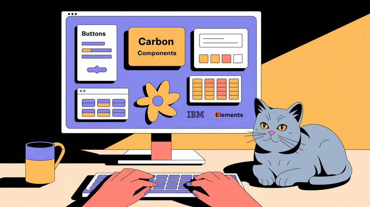
Orchestrating UI Harmony with Carbon Components React
1 view
Discover how Carbon Components React empowers developers to create stunning, accessible, and consistent user interfaces. This comprehensive guide explores the key features, installation process, and practical usage of IBM’s powerful React component library.
-

Command-K Mastery: Unleashing the Power of CMDK in React
10 views
Dive into the world of command palettes with CMDK, a powerful React library that enables developers to create fast, accessible, and customizable interfaces. This article explores the features, installation process, and advanced usage of CMDK, helping you elevate your React applications to new heights of user efficiency.
-

Chakra UI: Orchestrating Accessible React Symphonies
1 view
Chakra UI is a powerful React component library that combines accessibility, customization, and developer experience into a harmonious symphony. In this article, we’ll explore how Chakra UI can elevate your React projects and streamline your development process.
-
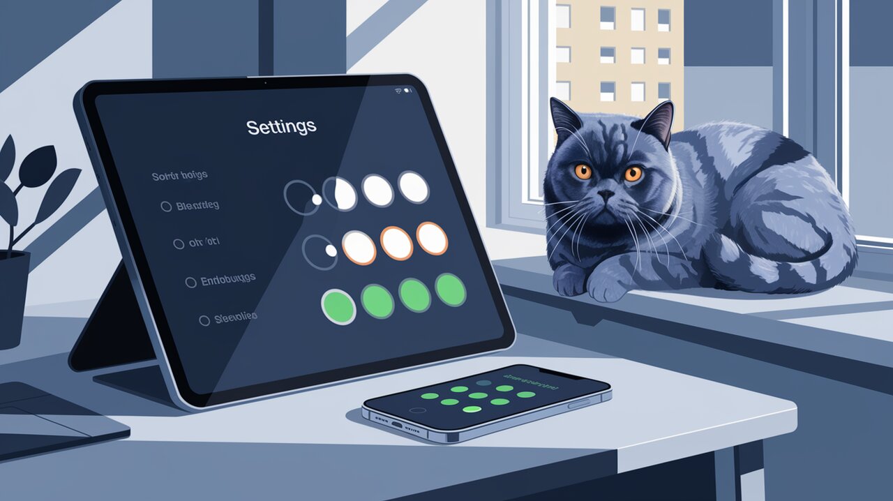
Toggle Like iOS: Unleashing React-Toggle Magic in Your UI
2 views
Elevate your React application’s user interface with the sleek and accessible react-toggle component. This article explores how to implement and customize these iOS-style switches, enhancing both the visual appeal and usability of your forms and settings pages.
-

Unleash Your Creativity with shadcn/ui: A React Component Playground
3 views
Explore the world of shadcn/ui, a revolutionary approach to React component libraries that encourages developers to copy, paste, and customize components for their unique project needs.
-

AgnosticUI React: Unleashing UI Wizardry Across Frameworks

2 views
Explore the power of AgnosticUI React, a component library that brings framework-agnostic design principles to your React projects. Learn how to create consistent, accessible, and customizable user interfaces with ease.
-

React Headings: Crafting Semantic Structure with Ease
1 view
React Headings is a powerful library that takes the guesswork out of maintaining proper heading hierarchy in complex React applications. This article explores how to leverage React Headings to improve accessibility and SEO while maintaining full control over your rendered content.